Note
Go to the end to download the full example code.
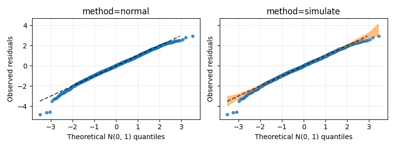
QQDisplay on Gaussian regression#
Plot a QQ-plot for a Gaussian regression on a dataset with powerlifters.
Explained variance: 0.8568129733333859
import matplotlib.pyplot as plt
from generalized_additive_models import GAM, Categorical, Spline
from generalized_additive_models.datasets import load_powerlifters
from generalized_additive_models.inspection import QQDisplay

# Load data
df = load_powerlifters()

# Predict total weight lifted, given age, bodyweight and sex
target = df["totalkg"]
age = Spline("age")
bodyweight = Spline("bodyweightkg")
sex = Categorical("sex")

terms = age + bodyweight + sex
gam = GAM(terms=terms, distribution="normal", link="identity")
gam.fit(df, target)

print("Explained variance:", gam.score(df, target))

# Create figure, then showcase each method
fig, axes = plt.subplots(1, 2, sharex=True, sharey=True, figsize=(8, 3))

for method, ax in zip(["normal", "simulate"], axes.ravel()):
    ax.set_title(f"method={method}")

    QQDisplay.from_estimator(
        gam, df, target, residuals="deviance", method=method, ax=ax
    )
    ax.grid(True, ls="--", alpha=0.33)

plt.tight_layout()
plt.show()
Total running time of the script: (0 minutes 0.249 seconds)